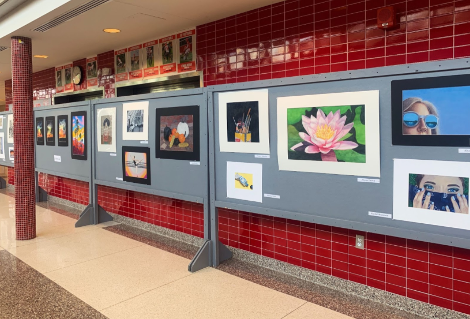
Last month in the main foyer, students were given the opportunity to display their work in a makeshift art show. The pieces shown displayed all types of art including photography, drawing, and painting. This was an exciting opportunity for many JD seniors to display their work before graduation.
Art teacher Ms.Childers, who conducted the art show, explained what changes had to be made to the art show and the art department in general this year due to the pandemic. “We were really unsure of what to expect this year. My biggest challenge was pacing – to go from 2 or 3 classes a week to just one in-person class meant projects took much longer than a typical year. We reduced the physical scale so work could be completed faster and students could explore more materials. I always try to get students used to the idea of making decisions; for example, what materials do they like using and what would they like to explore, either conceptually or visually? This year I took it a step further and tried to give students as much control as possible – it was more about the process and less about the finished product.”
Childers was very proud and impressed with her student’s work. She said, “Students worked really hard in class this year and we had a great show that was a little smaller in scale. Seniors Avery Young, Mara Durkin, and Kaylie Young kindly did demonstrations during the Budget Vote so community members could see and ask questions about their process.” She added, “The most bittersweet part of the Art Show is always hanging the senior work: seeing what they’ve accomplished and knowing that you’ll miss them next year!”
Below, students Gabby McNally, Avery Young, and Kenzy Zikry gave insight into their artwork.
Gabby McNally ‘24
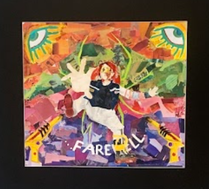
McNally claims she “never went into this with any sort of specific message; kind of just “made”, blinked, and it suddenly appeared as some tangible thing.” She then went on to say how if they really wanted to dig deep into the message behind this she “could consider this being about being consumed, or falling down a pit of, ideas and ideals, of color and other grandiose things; letting words and other types of media consume you.” Saying that this message would be “quite fitting for both the character central to this piece and the fact that I literally mutilated magazines and used mixed media to create this piece.” While the message may not have been there at the start, the inspiration however, was. McNally says the “muse” for this specific piece, and for many of them was the band “My Chemical Romance.” More specifically the main character in the album, Danger Days: The True Lives Of The Fabulous Killjoys. “The band’s work has inspired me for years, and the concept brought forth in the album in question; four anti-heroes facing corrupt corporations in the wake of what can be best described as an apocalypse, opposing these conglomerate gentrifiers with color and defiance, always sparked my interest.”
McNally used a unique take on art when creating this, not just using one of the parts to say “basic” forms of what you think when you hear the word art to create this. It was a new technique for them, since normally sticking to “light watercolor of characters and figures with easy-on-the-eye backgrounds, and maybe some ransom-note looking letters from magazines to make up lyrics and poetry added to the background.” How the “acrylic paint, large scale, and use of three-dimensional or pop-out aspects really sets this apart from my usual work.” Nonetheless of fantastic, it took nothing short of 4 months to curate starting in January. This was due to many factors like the tedious work, cutting and pasting, searching for a matching color pallet, and of course, hybrid learning.
Avery Young ‘21
“Ocular Paralysis”
Young explained that this first piece is inspired by a photo from a scene of the 2017 thriller, Get Out. But rather, instead of using the photo of the actor from the scene of the actual movie itself, she took her own photo of her neighbor and based the drawing off of that. When taking the photo, she tried to make it very similar to the original, even down to creating a very similar background. She says “This piece took a lot of time. I’m a perfectionist and so, I’m very into details which is mainly why I take so long with every piece.” At the start, she wasn’t too sure if she was going to show this due to her fear of people seeing her art, but as she said herself, “my amazing art teachers convinced me to do so”.
Next piece: “Chandelier”
Young claims there is no meaning behind this piece. It is what you see, a three-pronged chandelier hanging from the ceiling. There is no inspiration really either. The assignment in question was the prompt of reflection, so rather than doing something straight on, she “added a little spice by doing it at an angle.” She said this piece was no short of taking a while either: “With this piece I was close to the end and basically pulled an all-nighter and came in the next day with it all done. I was ‘in the zone’ and I was trying to meet the Scholastic deadline.” Young produces most of her work in black and white, and since this was a reflective assignment, it was fitting to continue her use of black and white for this as well.
Again, Young claimed there really was no deep meaning or explanation behind this piece. It was meant as a challenge to help her get out of her comfort zone. Though, she explained how if she had to come up with something it would be: “It kinda looks like she’s daydreaming and so there’s sort of meaning there because that’s why I chose the swirly background.” Mainly sticking in the realm of black and white art, this was her first big piece in color. She said, “ It was cool to try something different and challenge myself.” However, that doesn’t mean it was necessarily a breeze to do: “This took a long time too, especially since colored pencil is NOT my favorite medium to work with. So some days I didn’t want to even look at it.” Nonetheless, she decided to show it because “it shows some progress in my versatility as an artist.”
While this particular piece isn’t necessarily complete, Young explained how Ms.Childers gave her the push to add it in since she normally “(doesn’t) ever show (her) work to anyone let alone advertise it before it’s done-”. The inspiration behind this piece is one very close to her as it is actually one taken by her aunt of her great grandparents. She said, “These are my great grandparents who are in their 90s. Currently, I’m in the process of finishing this piece up as a gift to them. This is a very special project for me because this picture captured a perfect moment of them. Overall it’s very meaningful to my family and I.” As a senior, Young wanted this, as her last piece, to not only be meaningful but in her comfort zone of what she enjoys doing, black and white.
Kenzy Zikry ‘22
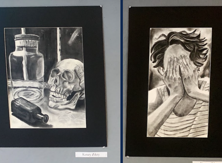
Zikry proves that there doesn’t always need to be a hidden message or a big conglomerate explanation behind her work. There was no target inspiration or specific message behind either of these pieces, yet they’re both still amazingly curated. Zikry explained what really stands out to her by saying she likes that “it’s straight to the point, black and white, no deep thoughts or hidden connections behind it.” Charcoal is normally the style Zikry goes for when working on art projects, so she’s had time to perfect the techniques in using it.
More images from the art show below.


